Generally I like Mail Chimp as a company and their UX so I might add to this blog post over time.
Validation
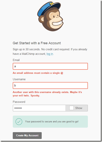
Nothing ground breaking here and it could be more responsive to the user as they insert data but I quite liked the green tick on green background to indicate a valid password. Perhaps the errors could be in a similar style.


No comments:
Post a Comment