Friday, 30 March 2012

Debugging with SOS, SOSEX and Dumps in Visual Studio

Note: This has been tested on x86 machine, I’ll update at a later point for x64 machine.

SOS (Son of Strike) Debugging Extension

You’ll need to set the “Enable unmanaged code debugging” property on the project to true.

enable-unmanaged-code-debugging

From the Immediate window you can execute the following commands:

Task Command
Load the extension .load sos
Displays all .NET objects in memory
[memory table, item count and total size]
!DumpHeap –stat
Displays all instances of that particular type
[memory address, memory table, size]
!DumpHeap –mt <method table id>
Displays all objects holding a reference to an object address !gcroot <address>
Outputs the current Call Stack !CLRStack
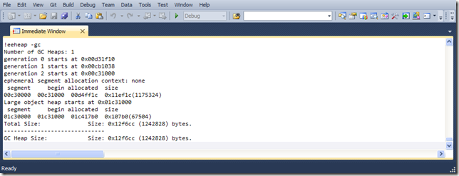
Outputs info on objects on the heap !EEHeap -gc
Lists all threads !threads
Lists work threads info !threadpool

SOSEx is an extension that gives you more commands to help debugging (scroll to the end of the blog post for the link).

taskmanagerdumpheap -stat DumpHeap-GCRoot eeheap -gc 

Dumps

Once you create a dump from your process (.dmp file), you can load it back into Visual Studio and the IDE will load the source file and you’ll be able to look at the variables at that point in time.

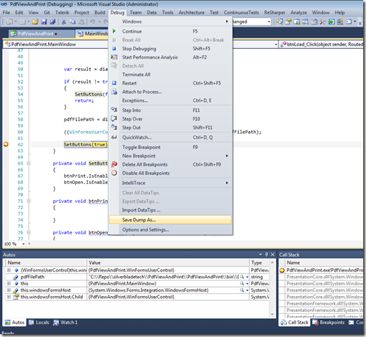
You can generate a dump file from Visual Studio by hitting a breakpoint and selecting Debug > Save Dump As.  You can close your solution and open the dump file in Visual Studio. 

To generate a dump file in production take a look at SuperAssert.NET.

Save-dump-as

Link Resources

SOSEx: http://www.stevestechspot.com

SuperAssert.NET can help generate dump files in production: http://msdn.microsoft.com/en-us/magazine/cc188701.aspx

Install Windows SDK: http://msdn.microsoft.com/en-us/windows/hardware/gg463009.aspx

Thursday, 29 March 2012

WPF Interop: COM, ActiveX OCX and PDF fun

Here is an application that displays a PDF file inside a WPF window. 

To do this, the easiest way is to interop with the Adobe Reader COM ActiveX (OCX) control.

image

So how does WPF deal with COM and ActiveX (OCX controls), given the disparity between how classic Win32 and WPF handles HWNDs.

Classic Win32: One HWND per control
WPF: One HWND per window/dialog


Containers

The solution is to create:

  • a WPF window containing
  • a WindowsFormsHost control containing
  • a WinForms User Control containing
  • the ActiveX control


For our example we’ll be using the Adobe Acrobat Reader and you will need this installed if you wish to run the code and application.

Please note:
You cannot use this COM component outside of the main UI thread as the OCX is not thread-safe.

Here are the steps I took:

Add WinForms User Control

image

Add COM Reference to the project

add-COM-references

“Add Tab” to the Toolbox called Adobe, “Choose Items…” and add the Adobe PDF Reader

add-adobe-tab    choose-itemsCOM-components

You can now drag and drop the Adobe PDF Reader control from the Toolbox onto the WinForms User Control.

Drag-COM-OCX-component-to-WinFormUserControl

By dragging the control onto the surface it ensures the OCX is correctly registered by the form.

What C# code does that actually produce?

Add your code behind to the WinForms User Control

Finally, add a WindowsFormsHost control to your WPF window and add the WinForms UserControl as a child

To print just right click on the document and select Print.

Here is the same solution with a notify event raised by the WinForm User Control, to enable communication with the Wpf window:

Source code: http://stevenhollidge.com/blog-source-code/PdfViewAndPrint.zip

Source code:  http://stevenhollidge.com/blog-source-code/PdfViewAndPrint_with_event.zip

Wednesday, 28 March 2012

ViewModels for Enums

Here is a neat trick for providing a generic view model for your enums:

image

The DisplayText is looked up from a resource file containing strings for the application. 

There is also a little static helper class for enums, which doesn’t do a lot but I think helps to keep code a little cleaner:

Source code including unit tests:  http://stevenhollidge.com/blog-source-code/EnumViewModel.zip

Tuesday, 27 March 2012

WPF Custom Control with Image

In this example we are going to create a custom control in WPF called MetroTile.

Our MetroTile control will expose three properties to let designers set an image icon, a display count and a text property.  The usual core properties for controls are also settable such as background, foreground, margin, etc.

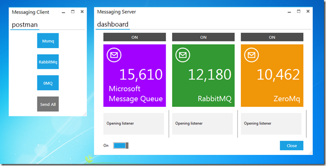
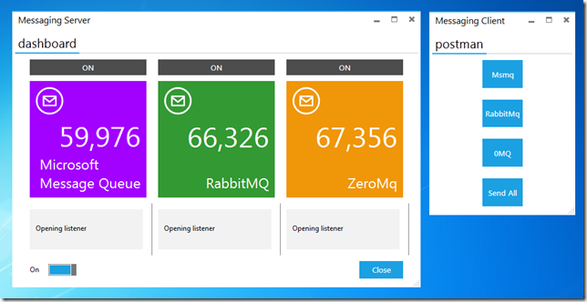
This screenshot shows three instances of the custom control in use, all with the generic template applied.  The RabbitMQ and ZeroMq tiles override the default background. 
image

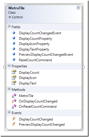
Class Diagram

image

Key concepts

Three dependency properties that allow the Xaml data binding system to do its work.

I’ve also shown how to expose a bubbling RoutedEvent (travels up the visual tree until handled) through the DisplayCountChanged event.  As is common, I’ve included a Preview RoutedEvent that tunnels down the visual tree, which fires just before the main event.

A public RoutedUICommand called ResetCountCommand is also included which you can bind to from Xaml.  Commands are preferred to methods as you cannot bind directly to methods.

MetroTile Custom Control

Default Template
default-template

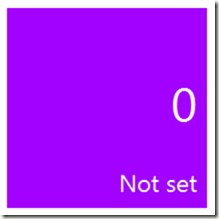
The display icon is located in top left hand corner when set by the developer using the custom control.  When the developer first includes the control in their xaml, the following default values are visible on their design surface:

From Template Purple background
  White foreground
From Custom Control Empty display icon
  “Not Set” display text
  Zero display count

Example of MetroTile in use

image

For information on the functionality of this example application, visit the following blog post:  http://stevenhollidge.blogspot.co.uk/2012/03/metro-messaging.html

Custom Control: MetroTile

using System.ComponentModel;
using System.Windows;
using System.Windows.Controls;
using System.Windows.Input;
using System.Windows.Media;

namespace Common.Controls
{
[TemplatePart(Name="PART_DISPLAY_ICON", Type=typeof(Image))]
[TemplatePart(Name = "PART_DISPLAY_COUNT_CONTAINER", Type = typeof(TextBlock))]
[TemplatePart(Name = "PART_DISPLAY_TITLE_CONTAINER", Type = typeof(TextBlock))]
[Description("Represents a metro styled tile that displays an icon, a count and a title")]
public class MetroTile : Control
{
#region Constructor

static MetroTile()
{
DefaultStyleKeyProperty.OverrideMetadata(typeof(MetroTile),
new FrameworkPropertyMetadata(typeof(MetroTile)));

CommandManager.RegisterClassCommandBinding(
typeof(MetroTile),
new CommandBinding(ResetCountCommand, OnResetCountCommand));
}

#endregion

#region Dependency Properties

#region DisplayIcon

public static readonly DependencyProperty DisplayIconProperty =
DependencyProperty.Register("DisplayIcon",
typeof (ImageSource),
typeof (MetroTile),
new PropertyMetadata(null));

[Description("The icon displayed in the tile."), Category("Common Properties")]
public ImageSource DisplayIcon
{
get { return (ImageSource)this.GetValue(DisplayIconProperty); }
set { this.SetValue(DisplayIconProperty, value); }
}

#endregion

#region DisplayCount

public static readonly DependencyProperty DisplayCountProperty =
DependencyProperty.Register("DisplayCount",
typeof(int),
typeof(MetroTile),
new UIPropertyMetadata(0));

[Description("The count displayed in the tile."), Category("Common Properties")]
public int DisplayCount
{
get { return (int)this.GetValue(DisplayCountProperty); }
set { this.SetValue(DisplayCountProperty, value); }
}

#endregion

#region DisplayText

[Description("The text displayed in the tile."), Category("Common Properties")]
public static readonly DependencyProperty DisplayTextProperty =
DependencyProperty.Register("DisplayText",
typeof(string),
typeof(MetroTile),
new PropertyMetadata("Not set"));

public string DisplayText
{
get { return (string)this.GetValue(DisplayTextProperty); }
set { this.SetValue(DisplayTextProperty, value); }
}
#endregion

#endregion

#region Events

public static readonly RoutedEvent DisplayCountChangedEvent =
EventManager.RegisterRoutedEvent("DisplayCountChanged",
RoutingStrategy.Bubble,
typeof(RoutedEventHandler),
typeof(MetroTile));

public event RoutedEventHandler DisplayCountChanged
{
add { AddHandler(DisplayCountChangedEvent, value); }
remove { RemoveHandler(DisplayCountChangedEvent, value); }
}

protected virtual void OnDisplayCountChanged(int oldValue, int newValue)
{
// 1. Pair of events: A preview that tunnels and a main event that bubbles
// 2. We could also create our own RoutedEventArgs that includes oldValue & new Value

var previewEvent = new RoutedEventArgs(PreviewDisplayCountChangedEvent);
RaiseEvent(previewEvent);

var e = new RoutedEventArgs(DisplayCountChangedEvent);
RaiseEvent(e);
}

public static readonly RoutedEvent PreviewDisplayCountChangedEvent =
EventManager.RegisterRoutedEvent("PreviewDisplayCountChanged",
RoutingStrategy.Tunnel,
typeof(RoutedEventHandler),
typeof(MetroTile));

public event RoutedEventHandler PreviewDisplayCountChanged
{
add { AddHandler(PreviewDisplayCountChangedEvent, value); }
remove { RemoveHandler(PreviewDisplayCountChangedEvent, value); }
}

#endregion

#region Commands

public static readonly ICommand ResetCountCommand =
new RoutedUICommand("ResetCount", "ResetCount", typeof(MetroTile));

private static void OnResetCountCommand(object sender, ExecutedRoutedEventArgs e)
{
var target = (MetroTile)sender;
target.DisplayCount = 0;
}

#endregion

}
}
<Style TargetType="{x:Type c:MetroTile}">
<Setter Property="Template">
<Setter.Value>
<ControlTemplate TargetType="{x:Type c:MetroTile}">
<Border Background="{StaticResource MetroPurpleBrush}">
<Grid Background="{Binding Path=Background, RelativeSource={RelativeSource TemplatedParent}}">

<Grid.RowDefinitions>
<RowDefinition Height="*" />
<RowDefinition Height="1.25*" />
</Grid.RowDefinitions>

<Grid.ColumnDefinitions>
<ColumnDefinition Width="*" />
</Grid.ColumnDefinitions>

<Image x:Name="PART_DISPLAY_ICON"
Grid.Row="0"
Grid.Column="0"
Margin="10,10,0,0"
HorizontalAlignment="Left"
VerticalAlignment="Top"
Source="{Binding Path=DisplayIcon,
RelativeSource={RelativeSource TemplatedParent},
UpdateSourceTrigger=PropertyChanged}"
Stretch="None" />

<TextBlock x:Name="PART_DISPLAY_COUNT_CONTAINER"
Grid.Row="1"
Grid.Column="0"
Grid.ColumnSpan="2"
Margin="0,0,10,0"
HorizontalAlignment="Right"
FontSize="48"
Foreground="White"
Text="{Binding Path=DisplayCount,
StringFormat=N0,
RelativeSource={RelativeSource TemplatedParent},
UpdateSourceTrigger=PropertyChanged}" />

<TextBlock x:Name="PART_DISPLAY_TITLE_CONTAINER"
Grid.Row="2"
Grid.RowSpan="2"
Grid.Column="0"
Grid.ColumnSpan="3"
Margin="10"
HorizontalAlignment="Right"
VerticalAlignment="Bottom"
FontSize="24"
Foreground="White"
Text="{Binding Path=DisplayText,
RelativeSource={RelativeSource TemplatedParent},
UpdateSourceTrigger=PropertyChanged}"
TextWrapping="Wrap" />
</Grid>
</Border>
</ControlTemplate>
</Setter.Value>
</Setter>
</Style>


Source code:  http://stevenhollidge.com/blog-source-code/Messaging.zip

Monday, 26 March 2012

Isolated Storage

Here’s a nice solution for dealing with WPF isolated storage.

It’s really simple to use, via a nice SaveSettings / ReadSetting interface.

You just need to create a class that holds all your settings as public properties and pass the object into the settings service.

isolated-storage-diagram

Saving to isolated storage

var settings = new ApplicationSettings
{
ShowTipsOnStartup = true,
ShowSplashScreen = false,
ItemsPerPage = 25
};

ISettingsProvider service = new SettingsProvider();
service.SaveSettings(settings);

Reading from isolated storage

ISettingsProvider service = new SettingsProvider();
var settings = service.GetSettings<ApplicationSettings>();


Source code:  http://stevenhollidge.com/blog-source-code/IsolatedSettings.zip

Fluent Assertions

Using the Fluent Assertions framework in your tests can make your code more compact and readable.

Take this simple example of testing a clone method by asserting that two instances of the same object have the same property values.

Without Fluent Assertions:

With Fluent Assertions:

In this example I happen to have used xUnit to create my tests.

Here’s the same example comparing all properties except the Id property:

Fluent Assertions:  http://fluentassertions.codeplex.com/

xUnit:  http://xunit.codeplex.com/

Thursday, 22 March 2012

Metro Messaging

Unable to display content. Adobe Flash is required.

Here is a Metro styled client/server application that sends messages via queues:

metro-messaging-2

Queuing Frameworks

msmq

rabbitmq

zeromq


Other Frameworks

elysium

mvvmlight

Other Concepts

  • Real time updating Metro style Tiles as messages are received
  • Custom user control with data binding including dependency properties
  • Value converter as mark up extension (no need to reference as a resource)
  • Auto scrolling textboxes using custom attached property
  • Generics with predicates
  • MVVM Light locator, messenger, relay commands and view models
  • Metro style app with Elysium and Metro Icons (http://metro.windowswiki.info/)
  • Custom Build Event:    copy $(SolutionDir)Libs\zeromq\libzmq.dll $(TargetDir)

Deployment

You’ll need to install the server components for MSMQ and RabbitMQ before running the solution from the downloadable source below.

Source code:  http://stevenhollidge.com/blog-source-code/Messaging.zip

Monday, 19 March 2012

Redis and MemCached with C#

Here are a couple of simple C# examples for Redis and MemCached. 

Please note, the Redis server included in this example should not be used in production code.

Dummy data

data

I use a factory method to create a number of clients with a number trades, which then get written to and read from Redis and MemCached.

Redis

MemCached

redis-vs-memcache

To run the Redis and MemCached servers included in the source code below, with default settings just run each executable:

  • \Redis-Server\redis-server.exe
  • \MemCached-Server\memcached.exe

Both Redis and MemCached are designed to be distributed over multiple machines.  Bear in mind, Redis with the default settings persists the data to disk, which you can turn off, whereas MemCached is purely in memory.

The above code examples have been altered to display purely the relevant code for interacting with Redis and MemCache.  The source code below contains additional code such as writing to the console window and making use of the stopwatch.

Source code:  http://stevenhollidge.com/blog-source-code/RedisAndMemCachedDemo.zip

Thursday, 15 March 2012

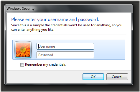
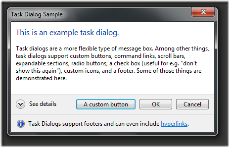
Ookii Dialogs for Wpf

Here is a library for Wpf dialogs:  http://www.ookii.org/software/dialogs/

credentialdialogfolderbrowserdialoginputdialogprogressdialogtaskdialog

WPF Metro Solution Shell

Over the next couple of weeks I’ll be releasing a WPF solution which gives application developers the ability to get their projects up and running so they can concentrate on solving business problems. 

As a reference/starting point I’m thinking I’ll add a couple of “real world” applications pages into the solution as separate pluggable projects.  Perhaps a stock market app using a real time data feed from the web and a Fx Rates screen using an local event style service.

It will also make us of various libraries such as MVVMLight Toolkit, Rx Extensions, MahApps, Extended WPF Toolkit and maybe a few more.

Anyway, for now here’s a screenshot of the login page.

login-screenshot

Monday, 12 March 2012

Adorners

If you require a generic piece of UI that could be applied in various scenarios, an adorner might come in useful.

An adorner is applied as an overlay to your controls.

In this example, each adorner will add a circle above different types of UI elements (buttons, labels, textblocks and textbox).

adorner

Adorner

Display Xaml

Code behind applying the adorner to each UI Element

Source code:  http://stevenhollidge.com/blog-source-code/WpfAdorner.zip

Dependency Properties in User Control

In order to be able to expose custom properties that take advantage of xaml data binding, you need to use dependency properties.

In this simple example we create a user control exposing four dependency properties, which will allow our developers to be able to create the following instance:

player-control

Our User Control

class-diagram

For each property you’ll need a dependency property field which gets exposed through a normal .NET property wrapper.  This is to enable Xaml to make use of the data binding system:

PlayerControl.xaml.cs

using System.ComponentModel;
using System.Windows;
using System.Windows.Media;

namespace WpfCustomUserControl
{
public partial class PlayerControl
{
#region Dependency Properties

public static readonly DependencyProperty ShirtNumberProperty =
DependencyProperty.Register("ShirtNumber",
typeof(int),
typeof(PlayerControl),
new PropertyMetadata(0));

[Bindable(true)]
public int ShirtNumber
{
get { return (int)this.GetValue(ShirtNumberProperty); }
set { this.SetValue(ShirtNumberProperty, value); }
}

public static readonly DependencyProperty KitColorProperty =
DependencyProperty.Register("KitColor",
typeof(Brush),
typeof(PlayerControl),
new PropertyMetadata(new SolidColorBrush(Color.FromArgb(0, 0, 0, 0))));

[Bindable(true)]
public Brush KitColor
{
get { return (Brush)this.GetValue(KitColorProperty); }
set { this.SetValue(KitColorProperty, value); }
}

public static readonly DependencyProperty SurnameProperty =
DependencyProperty.Register("Surname",
typeof(string),
typeof(PlayerControl),
new PropertyMetadata("Not set"));

[Bindable(true)]
public string Surname
{
get { return (string)this.GetValue(SurnameProperty); }
set { this.SetValue(SurnameProperty, value); }
}

public static readonly DependencyProperty PositionProperty =
DependencyProperty.Register("Position",
typeof(string),
typeof(PlayerControl),
new PropertyMetadata("Not set"));

[Bindable(true)]
public string Position
{
get { return (string)this.GetValue(PositionProperty); }
set { this.SetValue(PositionProperty, value); }
}

#endregion

public PlayerControl()
{
InitializeComponent();
}
}
}

Note: I've included a bindable attribute to the dependency properties that is not required but I add as a best practice.


The xaml for our user control can then hook up the data binding.


PlayerControl.xaml

<UserControl x:Class="WpfCustomUserControl.PlayerControl"
xmlns="http://schemas.microsoft.com/winfx/2006/xaml/presentation"
xmlns:x="http://schemas.microsoft.com/winfx/2006/xaml"
xmlns:d="http://schemas.microsoft.com/expression/blend/2008"
xmlns:mc="http://schemas.openxmlformats.org/markup-compatibility/2006"
x:Name="CustomPlayer"
Width="120"
Height="90"
mc:Ignorable="d">
<Grid>
<Button>
<StackPanel>
<Ellipse Width="30"
Height="30"
Fill="{Binding Path=KitColor,
ElementName=CustomPlayer,
Mode=TwoWay,
UpdateSourceTrigger=PropertyChanged}" />
<TextBlock Margin="0,-25"
HorizontalAlignment="Center"
FontSize="16"
Foreground="White"
Text="{Binding Path=ShirtNumber,
ElementName=CustomPlayer,
Mode=TwoWay,
UpdateSourceTrigger=PropertyChanged}" />
<TextBlock Margin="0,10,0,5"
HorizontalAlignment="Center"
FontSize="15"
Text="{Binding Path=Surname,
ElementName=CustomPlayer,
Mode=TwoWay,
UpdateSourceTrigger=PropertyChanged}" />

<TextBlock HorizontalAlignment="Center"
Text="{Binding Path=Position,
ElementName=CustomPlayer,
Mode=TwoWay,
UpdateSourceTrigger=PropertyChanged}" />
</StackPanel>
</Button>
</Grid>
</UserControl>


Note: No data binding is set on the user control as this will be set at runtime by the developer using the usercontrol. The element name within the usercontrols controls points to itself to enable data binding to work.


We can now easily reuse our user control setting the properties for each instance.


England-team


MainWindow.xaml


<Window x:Class="WpfCustomUserControl.MainWindow"
xmlns="http://schemas.microsoft.com/winfx/2006/xaml/presentation"
xmlns:x="http://schemas.microsoft.com/winfx/2006/xaml"
xmlns:local="clr-namespace:WpfCustomUserControl"
Title="England Footy Team"
Icon="Football.ico"
Height="500" Width="600">
<Grid x:Name="mainGrid">
<Grid.RowDefinitions>
<RowDefinition Height="10"/>
<RowDefinition Height="100"/>
<RowDefinition Height="120"/>
<RowDefinition Height="10"/>
</Grid.RowDefinitions>

<Grid.Resources>
<Style TargetType="WrapPanel">
<Setter Property="HorizontalAlignment" Value="Center" />
</Style>
</Grid.Resources>

<WrapPanel Name="panelGoalKeeper" Grid.Column="0" Grid.Row="1">
<local:PlayerControl x:Name="btnGK"
ShirtNumber="1"
KitColor="Green"
Surname="Hart"
Position="Keeper" />
</WrapPanel>

<WrapPanel Name="panelDefenders" Grid.Column="0" Grid.Row="2">
<local:PlayerControl x:Name="btnDF1"
ShirtNumber="2"
KitColor="Crimson"
Surname="Richards"
Position="Strong as an Ox"
Margin="0,25,25,0"/>
<local:PlayerControl x:Name="btnDF2"
ShirtNumber="5"
KitColor="Crimson"
Surname="Cahill"
Position="Ball playing stopper"
Margin="0,0,5,0"/>
<local:PlayerControl x:Name="btnDF3"
ShirtNumber="6"
KitColor="Crimson"
Surname="Jones"
Position="Marauding Sweeper"
Margin="5,0,0,0"/>
<local:PlayerControl x:Name="btnDF4"
ShirtNumber="3"
KitColor="Crimson"
Surname="Baines"
Position="Freekick specialist"
Margin="25,25,0,0"/>

</WrapPanel>

<WrapPanel Name="panelMidfielders" Grid.Column="0" Grid.Row="3">

<local:PlayerControl x:Name="btnMD1"
ShirtNumber="7"
KitColor="Crimson"
Surname="Wilshire"
Position="Playmaker"
Margin="0,25,25,0"/>
<local:PlayerControl x:Name="btnMD2"
ShirtNumber="4"
KitColor="Crimson"
Surname="Parker"
Position="Battler" />
<local:PlayerControl x:Name="btnMD3"
ShirtNumber="8"
KitColor="Crimson"
Surname="Gerrard"
Position="Attacking Midfielder"
Margin="25,25,0,0"/>
</WrapPanel>

<WrapPanel Name="panelStrikers" Grid.Column="0" Grid.Row="4">
<local:PlayerControl x:Name="btnST1"
ShirtNumber="9"
KitColor="Crimson"
Surname="Sturridge"
Position="The Future is bright"
Margin="0,25,25,0"/>
<local:PlayerControl x:Name="btnST2"
ShirtNumber="10"
KitColor="Crimson"
Surname="Rooney"
Position="Number 10" />
<local:PlayerControl x:Name="btnST3"
ShirtNumber="11"
KitColor="Crimson"
Surname="Welbeck"
Position="Striker"
Margin="25,25,0,0"/>
</WrapPanel>
</Grid>
</Window>

Source code:  http://stevenhollidge.com/blog-source-code/WpfCustomUserControl.zip