Showing posts with label Xaml. Show all posts

Saturday, 2 November 2013

Fluid Dialog Wizard for Silverlight

My Fluid Dialog Wizard is a copy from Visual Studio 2012 setup dialog:

Features plenty of cool stuff: my Modern UI tab control, plenty of visual state manager examples with storyboards, animations, render transforms and transitions, behaviours, draggable dialog, styles, a clip attached property (that forces a panel to clip it’s contents),

Source:    https://github.com/stevenh77/FluidDialogWizard

ModernUI Tab Control

This control gives you a ModernUI look and feel for a menu with animated slide in effect when the menu changes.

Source available here:  https://github.com/stevenh77/ModernUITabControl/

Friday, 25 October 2013

Path Markup Syntax

Taken from:  http://msdn.microsoft.com/en-us/library/ms752293.aspx

M= Start point

L = Creates a line to this end point

H = Creates a horizontal line between the current point and the specified x-coordinate. H 90 is an example of a valid horizontal line command.

V = Creates a vertical line between the current point and the specified y-coordinate. v 90 is an example of a valid vertical line command.

Z = Close

Friday, 13 September 2013

Setting format for Telerik RadDatePicker

First up remember there are two date pickers the RadDatePicker and the RadDateTimePicker.

You can specialise with your date hardcoded, or have a property that lets the developer set the value:

public class RadDatePickerWithSwissDates : RadDatePicker
{
public RadDatePickerWithSwissDates()
{
var ci = new CultureInfo("")
{
DateTimeFormat = { ShortDatePattern = "dd.MM.yyyy" }
};

this.Culture = ci;
}
}

Or you can use this approach:

public class TelerikDateFormatWorkaround
{
public CultureInfo CultureWithSwissFormat
{
//Hack to get around the fact that there is no custom date format in the Telerik DatePicker
//http://www.telerik.com/community/forums/wpf/datepicker/changing-dateformat.aspx
get
{
var tempCultureInfo = (CultureInfo)CultureInfo.CurrentCulture.Clone();
tempCultureInfo.DateTimeFormat.ShortDatePattern = "dd.MM.yyyy";
return tempCultureInfo;
}
}
}

// add it to the usercontrol resources in the usual way and then...

<Style TargetType="telerik1:RadDatePicker">
<Setter Property="Culture" Value="{Binding Source={StaticResource TelerikDateFormatWorkaround}, Path=CultureWithSwissFormat}"/>
</Style>

BooleanToVisibilityConverterMarkupExtension

public class BooleanToVisibilityConverterMarkupExtension : MarkupExtension, IValueConverter
{
private static BooleanToVisibilityConverterMarkupExtension converter;

public override object ProvideValue(IServiceProvider serviceProvider)
{
return converter ?? (converter = new BooleanToVisibilityConverterMarkupExtension());
}

public object Convert(object value, Type targetType, object parameter, System.Globalization.CultureInfo culture)
{
var v = (bool?)value;
return v.HasValue && v.Value ? Visibility.Visible : Visibility.Collapsed;
}

public object ConvertBack(object value, Type targetType, object parameter, System.Globalization.CultureInfo culture)
{
var v = (Visibility)value;
return v == Visibility.Visible;
}
}

<!-- usage in xaml -->
Visibility="{Binding IsVisible, Converter={converters:BooleanToVisibilityConverterMarkupExtension}}">>

Wednesday, 28 August 2013

How to find absolute position of control

The following code from MSDN come in very handy today, just change “this” to your control and it’ll give your the absolute position of your control on the page:

GeneralTransform gt = this.TransformToVisual(Application.Current.RootVisual as UIElement);
Point offset = gt.Transform(new Point(0, 0));
double controlTop = offset.Y;
double controlLeft = offset.X;

Thursday, 15 August 2013

How to flip a path in xaml

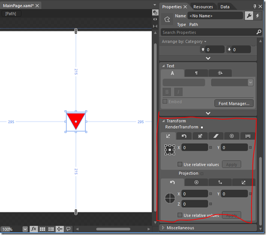
For those with Blend installed simply select the path and set the transform properties:

image

If you don’t have Blend then you can use on the following properties:

<Path Width="50" 
Height="50"
Data="F1M1719.66,218.12L1735.66,246.166 1751.66,274.21 1719.66,274.21 1687.66,274.21 1703.66,246.166 1719.66,218.12z"
Fill="Red"
Stretch="Uniform"
RenderTransformOrigin="0.5,0.5">
<Path.RenderTransform>
<CompositeTransform Rotation="-180"/>
</Path.RenderTransform>
</Path>

Tuesday, 23 April 2013

Xaml Header Template

An example of a header template used in a tab control, it’s toward the bottom of this code:

<UserControl
xmlns="http://schemas.microsoft.com/winfx/2006/xaml/presentation"
xmlns:x="http://schemas.microsoft.com/winfx/2006/xaml"
xmlns:sdk="http://schemas.microsoft.com/winfx/2006/xaml/presentation/sdk" xmlns:Primitives="clr-namespace:System.Windows.Controls.Primitives;assembly=System.Windows.Controls"
x:Class="ModernTabControl.MainPage">
<UserControl.Resources>
<Style TargetType="sdk:TabItem">
<Setter Property="IsTabStop" Value="False"/>
<Setter Property="Background" Value="#FFFAFAFA"/>
<Setter Property="BorderBrush" Value="#FFEEEEEE"/>
<Setter Property="BorderThickness" Value="1"/>
<Setter Property="Padding" Value="6,2,6,2"/>
<Setter Property="HorizontalContentAlignment" Value="Stretch"/>
<Setter Property="VerticalContentAlignment" Value="Stretch"/>
<Setter Property="Width" Value="90"/>
<Setter Property="Height" Value="40"/>
<Setter Property="Template">
<Setter.Value>
<ControlTemplate TargetType="sdk:TabItem">
<Grid x:Name="Root">
<VisualStateManager.VisualStateGroups>
<VisualStateGroup x:Name="CommonStates">
<VisualStateGroup.Transitions>
<VisualTransition GeneratedDuration="0"/>
<VisualTransition GeneratedDuration="0:0:0.1" To="MouseOver"/>
</VisualStateGroup.Transitions>
<VisualState x:Name="Normal"/>
<VisualState x:Name="MouseOver">
<Storyboard>
<DoubleAnimation Storyboard.TargetName="HeaderLeftUnselected" Storyboard.TargetProperty="Opacity" From="0.4" To="1" Duration="0:0:0" />
</Storyboard>
</VisualState>
<VisualState x:Name="Disabled" />
</VisualStateGroup>
<VisualStateGroup x:Name="SelectionStates">
<VisualState x:Name="Unselected"/>
<VisualState x:Name="Selected"/>
</VisualStateGroup>
<VisualStateGroup x:Name="FocusStates">
<VisualState x:Name="Focused" />
<VisualState x:Name="Unfocused" />
</VisualStateGroup>
</VisualStateManager.VisualStateGroups>
<Grid x:Name="TemplateLeftSelected" Visibility="Collapsed" Canvas.ZIndex="1">
<Border BorderBrush="{TemplateBinding BorderBrush}" BorderThickness="2,2,0,2" Background="{TemplateBinding Background}" CornerRadius="6,0,0,6" Margin="-2,-2,0,-2">
<Border BorderBrush="#FFFFFFFF" BorderThickness="2" CornerRadius="2,2,0,2">
<Grid>
<Rectangle Fill="#FFFFFFFF" Margin="0, -2, -4, -2" HorizontalAlignment="Stretch" VerticalAlignment="Stretch"/>
<ContentControl x:Name="HeaderLeftSelected"
Cursor="{TemplateBinding Cursor}"
Foreground="{TemplateBinding Foreground}"
FontSize="{TemplateBinding FontSize}"
HorizontalAlignment="Stretch"
IsTabStop="False"
VerticalAlignment="Stretch"/>
</Grid>
</Border>
</Border>
<Border x:Name="FocusVisualLeft" BorderBrush="#FF6DBDD1" BorderThickness="1,1,0,1" CornerRadius="3,0,0,3" IsHitTestVisible="false" Margin="-2,-2,0,-2" Visibility="Collapsed"/>
<Border x:Name="DisabledVisualLeftSelected" Background="#8CFFFFFF" CornerRadius="3,0,0,3" IsHitTestVisible="false" Margin="-2,-2,0,-2" Opacity="0"/>
</Grid>
<Grid x:Name="TemplateLeftUnselected" Visibility="Collapsed">
<Grid x:Name="GradientLeft">
<ContentControl x:Name="HeaderLeftUnselected"
Cursor="{TemplateBinding Cursor}"
Foreground="{TemplateBinding Foreground}"
FontSize="{TemplateBinding FontSize}"
Opacity="0.4"
HorizontalAlignment="Stretch"
IsTabStop="False"
VerticalAlignment="Stretch"/>
</Grid>
</Grid>
</Grid>
</ControlTemplate>
</Setter.Value>
</Setter>
</Style>
<Style TargetType="sdk:TabControl">
<Setter Property="IsTabStop" Value="False"/>
<Setter Property="Background" Value="#FFFFFFFF" />
<Setter Property="BorderBrush" Value="#FFEEEEEE" />
<Setter Property="BorderThickness" Value="2"/>
<Setter Property="Padding" Value="5"/>
<Setter Property="HorizontalContentAlignment" Value="Stretch"/>
<Setter Property="VerticalContentAlignment" Value="Stretch"/>
<Setter Property="Template">
<Setter.Value>
<ControlTemplate TargetType="sdk:TabControl">
<Grid>
<VisualStateManager.VisualStateGroups>
<VisualStateGroup x:Name="CommonStates">
<VisualStateGroup.Transitions>
<VisualTransition GeneratedDuration="0"/>
</VisualStateGroup.Transitions>
<VisualState x:Name="Normal"/>
<VisualState x:Name="Disabled">
<Storyboard>
<DoubleAnimationUsingKeyFrames Storyboard.TargetProperty="(UIElement.Opacity)" Storyboard.TargetName="DisabledVisualLeft">
<SplineDoubleKeyFrame KeyTime="0" Value="1"/>
</DoubleAnimationUsingKeyFrames>
</Storyboard>
</VisualState>
</VisualStateGroup>
</VisualStateManager.VisualStateGroups>
<Grid x:Name="TemplateLeft" Visibility="Collapsed">
<Grid.ColumnDefinitions>
<ColumnDefinition Width="Auto"/>
<ColumnDefinition Width="*"/>
</Grid.ColumnDefinitions>
<Primitives:TabPanel x:Name="TabPanelLeft" Margin="2,2,-1,2" Canvas.ZIndex="1"/>
<Border BorderBrush="{TemplateBinding BorderBrush}" BorderThickness="{TemplateBinding BorderThickness}" Background="{TemplateBinding Background}" Grid.Column="1" CornerRadius="0,3,3,0" MinWidth="10" MinHeight="10">
<ContentPresenter x:Name="ContentLeft" Cursor="{TemplateBinding Cursor}" HorizontalAlignment="{TemplateBinding HorizontalAlignment}" Margin="{TemplateBinding Padding}" VerticalAlignment="{TemplateBinding VerticalAlignment}"/>
</Border>
<Border x:Name="DisabledVisualLeft" Background="#8CFFFFFF" Grid.Column="1" CornerRadius="0,3,3,0" IsHitTestVisible="False" Opacity="0" Canvas.ZIndex="1"/>
</Grid>
</Grid>
</ControlTemplate>
</Setter.Value>
</Setter>
</Style>
<Style TargetType="TextBlock">
<Setter Property="FontFamily" Value="Segoe UI"/>
<Setter Property="FontSize" Value="13" />
</Style>
</UserControl.Resources>

<Grid x:Name="LayoutRoot" Background="#FFFAFAFA">
<sdk:TabControl HorizontalAlignment="Stretch"
VerticalAlignment="Stretch"
TabStripPlacement="Left"
Margin="20"
SelectedItem="{Binding SelectedProductGroup}">
<sdk:TabControl.Resources>
<DataTemplate x:Key="TabHeaderTemplate">
<Grid>
<Rectangle Fill="#00FFFFFF" Width="135" Height="70"/>
<TextBlock Text="{Binding .}" VerticalAlignment="Center" HorizontalAlignment="Center" />
</Grid>
</DataTemplate>
</sdk:TabControl.Resources>
<sdk:TabItem HeaderTemplate="{StaticResource TabHeaderTemplate}" Header="Overview">
</sdk:TabItem>
<sdk:TabItem HeaderTemplate="{StaticResource TabHeaderTemplate}" Header="Equities">
</sdk:TabItem>
<sdk:TabItem HeaderTemplate="{StaticResource TabHeaderTemplate}" Header="FX">
</sdk:TabItem>
<sdk:TabItem HeaderTemplate="{StaticResource TabHeaderTemplate}" Header="FX Flow">
</sdk:TabItem>
</sdk:TabControl>
</Grid>
</UserControl>

Source:  https://github.com/stevenh77/ModernTabControl/

Tuesday, 2 April 2013

Slow Silverlight debugging

If you’ve added a Xaml binding breakpoint and now have really slow performance when debugging, like your app being slow to load, animations not running smoothly etc then try this…

  1. Remove all xaml breakpoints
  2. Add System.Windows.Data.Binding.IsDebuggingEnabled = false within the App.xaml.cs constructor.

image

Run it once then you can remove the line, hope this helps some peeps out!

Friday, 29 March 2013

Animated Listbox

This example shows a nice fluid movement for items in a wrapping listbox.

Demo

Click here to open the Silverlight page and resize your browser: 

http://stevenhollidge.com/blog-source-code/animatedlistbox

Source code

SL version:  https://github.com/stevenh77/AnimatedListboxSL

WPF version:  https://github.com/stevenh77/AnimatedListboxWPF

Saturday, 27 October 2012

Some icons and paths

error       info       question       success

Cross

image

<?xml version="1.0" encoding="utf-8"?>
<Grid xmlns="http://schemas.microsoft.com/winfx/2006/xaml/presentation" xmlns:x="http://schemas.microsoft.com/winfx/2006/xaml" Background="black">
<Path Stretch="Fill" StrokeLineJoin="Round" Stroke="#FFFFFFFF" Fill="#FFFFFFFF" Data="M 22.0625,1.3432C 39.2625,-4.25677 59.1292,8.14319 61.6625,26.0099C 65.1292,42.9432 51.9292,60.5432 34.8625,62.2766C 18.8625,64.8099 2.32917,52.6765 0.0625,36.5432C -3.00417,21.4766 7.2625,5.47656 22.0625,1.3432 Z M 22.0625,5.47656C 11.3958,9.07654 3.12917,19.8765 3.52917,31.3432C 2.99583,46.4099 17.2625,59.8765 32.1958,58.5432C 47.2625,58.2766 60.0625,43.6099 58.0625,28.6765C 56.9958,11.7432 37.9292,-0.390137 22.0625,5.47656 Z M 18.4625,23.3432C 19.7958,21.8765 20.9958,20.5432 22.4625,19.4766C 25.2625,22.2766 28.0625,25.0765 30.9958,27.8765C 34.0625,25.2099 36.7292,22.0099 39.9292,19.4766C 41.1292,20.8099 42.3292,22.0099 43.5292,23.3432C 40.8625,26.4099 37.6625,29.0765 35.1292,32.2766C 38.0625,34.9432 40.8625,37.8765 43.5292,40.6765C 42.3292,42.0099 41.1292,43.3432 39.9292,44.6765C 36.7292,42.0099 34.0625,38.8099 30.9958,36.1432C 27.9292,38.9432 25.2625,42.1432 21.9292,44.6765C 20.8625,43.2099 19.6625,42.0099 18.5958,40.6765C 20.9958,37.7432 23.9292,35.2099 26.5958,32.4099C 25.1292,28.8099 20.8625,26.5432 18.4625,23.3432 Z "/>
</Grid>

Info


image

<?xml version="1.0" encoding="utf-8"?>
<Grid xmlns="http://schemas.microsoft.com/winfx/2006/xaml/presentation" xmlns:x="http://schemas.microsoft.com/winfx/2006/xaml" Background="black">
<Path Stretch="Fill" StrokeLineJoin="Round" Stroke="#FFFFFFFF" Fill="#FFFFFFFF" Data="M 22.0625,1.33777C 39.2625,-4.26221 59.1292,8.27112 61.6625,26.0045C 65.1292,42.9377 51.9292,60.5378 34.8625,62.2711C 18.8625,64.8044 2.32917,52.6711 0.0625,36.5378C -3.00417,21.4711 7.2625,5.47113 22.0625,1.33777 Z M 22.0625,5.47113C 11.3958,9.07111 3.12917,19.8711 3.52917,31.3378C 2.99583,46.4044 17.2625,59.8711 32.1958,58.5378C 47.2625,58.2711 60.0625,43.6044 58.0625,28.6711C 56.9958,11.7378 37.9292,-0.395569 22.0625,5.47113 Z M 28.3292,16.1378C 31.2625,14.9378 36.0625,15.3378 35.9292,19.3378C 35.9292,23.3378 31.2625,23.3378 28.4625,22.5378L 28.5958,21.3378C 28.5958,20.0045 28.5958,18.6711 28.4625,17.3378L 28.3292,16.1378 Z M 28.5958,21.3378C 25.7958,22.1378 25.7958,16.5378 28.4625,17.3378C 28.5958,18.6711 28.5958,20.0045 28.5958,21.3378 Z M 28.8625,26.2711C 30.9958,26.1378 32.9958,26.0045 35.1292,26.0045C 35.2625,33.6044 35.2625,41.0711 35.1292,48.6711C 32.9958,48.5378 30.9958,48.5378 28.8625,48.4044C 30.0625,48.0045 32.3292,47.3378 33.5292,47.0711C 34.3292,40.5378 34.1958,34.1378 33.5292,27.6044C 32.3292,27.3378 30.0625,26.6711 28.8625,26.2711 Z M 28.8625,26.2711C 30.0625,26.6711 32.3292,27.3378 33.5292,27.6044C 34.1958,34.1378 34.3292,40.5378 33.5292,47.0711C 32.3292,47.3378 30.0625,48.0045 28.8625,48.4044C 28.9958,41.0711 28.9958,33.6044 28.8625,26.2711 Z "/>
</Grid>


Question Mark


image

<?xml version="1.0" encoding="utf-8"?>
<Grid xmlns="http://schemas.microsoft.com/winfx/2006/xaml/presentation" xmlns:x="http://schemas.microsoft.com/winfx/2006/xaml" Background="black">
<Path Stretch="Fill" StrokeLineJoin="Round" Stroke="#FFFFFFFF" Fill="#FFFFFFFF" Data="M 22.1958,1.33777C 39.3958,-4.26224 59.2625,8.27112 61.7958,26.0044C 65.2625,42.9378 52.0625,60.5378 34.9958,62.2711C 18.8625,64.8044 2.4625,52.6711 0.0625,36.5378C -2.87083,21.4711 7.39583,5.4711 22.1958,1.33777 Z M 22.3292,5.4711C 11.5292,9.07111 3.2625,19.8711 3.6625,31.3378C 3.12917,46.4044 17.3958,59.8711 32.3292,58.5378C 47.3958,58.2711 60.1958,43.6044 58.1958,28.6711C 57.1292,11.7378 38.0625,-0.395569 22.3292,5.4711 Z M 24.7292,15.7378C 30.9958,11.8711 42.5958,14.6711 42.3292,23.3378C 43.1292,30.2711 34.0625,31.6044 33.3958,38.0044C 31.3958,38.0044 29.3958,38.0044 27.3958,37.8711C 27.6625,35.8711 27.7958,33.7378 28.5958,31.8711C 30.3292,29.0711 33.3958,27.3378 35.1292,24.5378C 35.3958,21.8711 33.1292,18.8044 30.1958,19.8711C 27.3958,20.2711 27.2625,23.7378 26.1958,25.7378C 23.9292,25.7378 21.6625,25.6044 19.3958,25.4711C 20.1958,21.8711 21.1292,17.7378 24.7292,15.7378 Z M 27.9292,41.6044C 29.5292,39.2044 32.5958,40.8044 34.4625,41.7378C 34.1958,43.7378 34.8625,46.8044 32.1958,47.6044C 28.7292,49.2044 25.1292,44.2711 27.9292,41.6044 Z "/>
</Grid>


Tick


image

<?xml version="1.0" encoding="utf-8"?>
<Grid xmlns="http://schemas.microsoft.com/winfx/2006/xaml/presentation" xmlns:x="http://schemas.microsoft.com/winfx/2006/xaml" Background="black">
<Path Stretch="Fill" StrokeLineJoin="Round" Stroke="#FFFFFFFF" Fill="#FFFFFFFF" Data="M 22.0625,1.33466C 38.7292,-4.13202 58.1958,7.46799 61.5292,24.8013C 65.7958,42.0013 52.4625,60.5347 34.8625,62.268C 18.8625,64.8013 2.32917,52.668 0.0625,36.668C -3.00417,21.468 7.2625,5.46799 22.0625,1.33466 Z M 22.0625,5.46799C 10.8625,9.20132 2.59583,20.8013 3.52917,32.668C 3.79583,47.2013 17.6625,59.7346 32.1958,58.5347C 47.2625,58.268 60.0625,43.6013 58.0625,28.668C 56.9958,11.7346 37.9292,-0.398682 22.0625,5.46799 Z M 41.7958,17.6013C 43.3958,18.668 47.7958,19.868 45.7958,22.4013C 39.9292,29.7346 34.4625,37.6013 28.1958,44.5347C 23.7958,40.8013 20.3292,36.268 16.3292,32.1347C 13.9292,30.1347 17.6625,28.268 18.9958,26.9347C 22.4625,29.2013 24.7292,33.068 28.0625,35.7346C 32.4625,29.468 37.3958,23.7346 41.7958,17.6013 Z "/>
</Grid>
Sunday, 23 September 2012

INPC Parent Child Notification

Here is a simple example of a parent listening to change notification from a child and exposing an aggregate value (or “denormalized” value in database terminology).

The Order (parent) exposes the TotalCost, which is a sum of the Cost properties in OrderLines (child).

image

public class Order : InpcBase
{
private readonly ObservableCollection<OrderLine> orderLines;

public Order()
{
orderLines = new ObservableCollection<OrderLine>();
}

public decimal TotalCost
{
get { return orderLines.Sum(ol => ol.Cost); }
}

public void AddOrderLine(OrderLine orderLine)
{
orderLine.PropertyChanged += orderLine_PropertyChanged;
}

private void orderLine_PropertyChanged(object sender, PropertyChangedEventArgs e)
{
if (e.PropertyName == "Cost") OnPropertyChanged("TotalCost");
}
}

public class OrderLine : InpcBase
{
private decimal cost;
public decimal Cost
{
get { return cost; }
set
{
if (cost == value) return;
cost = value;
OnPropertyChanged("Cost");
}
}
}

public abstract class InpcBase : INotifyPropertyChanged
{
public event PropertyChangedEventHandler PropertyChanged;
protected void OnPropertyChanged(string name)
{
PropertyChangedEventHandler handler = PropertyChanged;
if (handler == null) return;
handler(this, new PropertyChangedEventArgs(name));
}
}

Monday, 14 May 2012

Converting images to paths

Just a quick trick to convert an image into a vector based path in xaml. 

To be able to handle anything more than the most basic image you’ll probably need Expression Design installed.

For an example, I’m going to use the logo for what is probably xaml’s arch enemy…. HTML 5!

Here is our example image:  http://www.w3.org/html/logo/downloads/HTML5_Logo_512.png

The first step is to download Inkscape from the web:  http://inkscape.org/

It’s an open source SVG graphics editor.  When you open your PNG file, select to “embed” the image:

image

Now select the object:

image

And from the menu choose “Path > Trace Bitmap…”:

image

Make sure the “Colors” option is selected and click Ok:

image

This will make a create a Vector Path object on top of your original image (which is a bit weird), so you need to “Edit > Copy” then “File > New” and “Edit > Paste” to create a nice clean vector image.

Now we could just “Save As > Xaml” but unfortunately the Xaml created isn’t that compatible with WPF or Silverlight so we’ve got an extra hoop to jump through.  Give it a go and see how you get on.  If the resultant xaml doesn’t work in Kaxaml for example you’ll need to follow these extra steps.

We need to get the image into Expression Design.

Still within Inkscape for now, “Save As” file type PDF (stay with me on this one) and select texts to paths

image

Now rename your “.pdf” file to “.ai” file type and you can open it in Expression Design:

image

Now finally we can export to Xaml Silverlight 4 / WPF canvas and all is good in the world.

image

Wednesday, 25 April 2012

Binding Converter Parameters to StaticResources

Here is the bad news, you can’t but here’s the good news, using a bit of jiggery pokery you can easily work around it!

Scenario

image

I had a view containing three ellipses that I wanted to colour based on a property for their data context.  The expected result was blue if the value was zero, red if the value was greater than zero and yellow if something went wrong.

The Obvious Approach Doesn’t Work

I had my colours set in my UserControl.Resources so I would like to have used the following code:

<UserControl.Resources>
<SolidColorBrush x:Name="ZeroBrush" Color="SteelBlue" />
<SolidColorBrush x:Name="OverZeroBrush" Color="Red" />
</UserControl.Resources>

<Ellipse Fill="{Binding Path=Count,
Converter={converters:CountToBrushConverter
ZeroBrush={StaticResource ZeroBrush},
OverZeroBrush={StaticResource OverZeroBrush}}}" />
public class CountToBrushConverter : MarkupExtension, IMultiValueConverter
{
private static CountToBrushConverter _converter;
private readonly SolidColorBrush INCORRECT_USAGE_OF_CONVERTER = new SolidColorBrush(Color.FromArgb(255, 255, 255, 0));

public SolidColorBrush ZeroBrush { get; set; }
public SolidColorBrush OverZeroBrush { get; set; }

public object Convert(object[] values, Type targetType, object parameter, CultureInfo culture)
{
int count;
if (!Int32.TryParse(values[0].ToString(), out count)) return INCORRECT_USAGE_OF_CONVERTER;

return count == 0 ? ZeroBrush : OverZeroBrush;
}

public object[] ConvertBack(object value, Type[] targetTypes, object parameter, CultureInfo culture)
{
throw new NotImplementedException();
}

public override object ProvideValue(IServiceProvider serviceProvider)
{
return _converter ?? (_converter = new CountToBrushConverter());
}
}

The problem with this approach is that the value converter properties are not dependency objects and therefore cannot have a binding assigned to them.


The Solution


Swap your IValueConverter for an IMultiValueConverter and use an implementation of the multi-binding approach from WPF. 

<Ellipse Fill="{xaml:MultiBinding Converter={converters:CountToBrushConverter}, 
Source1={Binding Path=Count},
Source2={StaticResource ZeroBrush},
Source3={StaticResource OverZeroBrush}}" />
public class CountToBrushConverter : MarkupExtension, IMultiValueConverter
{
private static CountToBrushConverter _converter;
private readonly SolidColorBrush INCORRECT_USAGE_OF_CONVERTER = new SolidColorBrush(Color.FromArgb(255, 255, 255,0));

/// <summary>
/// Returns a SolidBrushColour based on whether the count = 0 or not
/// </summary>
/// <param name="values">Array of objects: value[0] = Count, value[1] = ZeroBrush, value[2] = OverZeroBrush</param>
/// <param name="targetType">Not used.</param>
/// <param name="parameter">Not used.</param>
/// <param name="culture">Not used.</param>
/// <returns>SolidBrushColor</returns>
public object Convert(object[] values, Type targetType, object parameter, CultureInfo culture)
{
if (values == null || values.Length != 3) return INCORRECT_USAGE_OF_CONVERTER;

int count;
if (!Int32.TryParse(values[0].ToString(), out count)) return INCORRECT_USAGE_OF_CONVERTER;

var zeroBrush = values[1] as SolidColorBrush;
if (zeroBrush == null) return INCORRECT_USAGE_OF_CONVERTER;

var overZeroBrush = values[2] as SolidColorBrush;
if (overZeroBrush == null) return INCORRECT_USAGE_OF_CONVERTER;

return count == 0
? zeroBrush
: overZeroBrush;
}

public object[] ConvertBack(object value, Type[] targetTypes, object parameter, CultureInfo culture)
{
throw new NotImplementedException();
}

public override object ProvideValue(IServiceProvider serviceProvider)
{
return _converter ?? (_converter = new CountToBrushConverter());
}
}

Multi Bindings for Silverlight


Henrik Jonsson has an implementation on Code Project:
http://www.codeproject.com/Articles/286171/MultiBinding-in-Silverlight-5

Colin Eberhardt has another option on his blog:
http://www.scottlogic.co.uk/blog/colin/2010/05/silverlight-multibinding-solution-for-silverlight-4/

You can download a zip of the version I used:
http://stevenhollidge.com/blog-source-code/MultiBinding.zip

Monday, 23 April 2012

PropertyPathHelper

Ever needed to get the value from a binding in code?   Well here you go.

public static class PropertyPathHelper
{
private static readonly Dummy _dummy = new Dummy();

public static object GetValue(object source, string propertyPath)
{
var binding = new Binding(propertyPath)
{
Mode = BindingMode.OneTime,
Source = source
};
BindingOperations.SetBinding(_dummy, Dummy.ValueProperty, binding);
return _dummy.GetValue(Dummy.ValueProperty);
}

private class Dummy : DependencyObject
{
public static readonly DependencyProperty ValueProperty =
DependencyProperty.Register("Value",
typeof (object),
typeof (Dummy),
new PropertyMetadata(null));
}
}
Thanks to Thomas Levesque for his answer on Stack Overflow:
http://stackoverflow.com/questions/3577802/wpf-getting-a-property-value-from-a-binding-path

BoolToValueConverter<T>

Here is a great little generic BoolTo… converter.  In the example below I use it to define the visibility of a textblock.

using System;
using System.Globalization;
using System.Windows.Data;
using System.Windows.Markup;

namespace SilverlightGlimpse.Converters
{
public class BoolToVisibilityConverter : BoolToValueConverter<Visibility> { }

public class BoolToValueConverter<T> : MarkupExtension, IValueConverter
{
public T FalseValue { get; set; }
public T TrueValue { get; set; }

public object Convert(object value, Type targetType, object parameter, CultureInfo culture)
{
if (value == null) return FalseValue;
return (bool)value ? TrueValue : FalseValue;
}

public object ConvertBack(object value, Type targetType, object parameter, CultureInfo culture)
{
return value != null && value.Equals(TrueValue);
}

public override object ProvideValue(IServiceProvider serviceProvider)
{
return this;
}
}
}
<TextBlock Visibility="{Binding Path=IsInDebugMode, 
Converter={local:BoolToVisibilityConverter
FalseValue=Collapsed,
TrueValue=Visible}}" />


Original author: http://geekswithblogs.net/codingbloke/archive/2010/05/28/a-generic-boolean-value-converter.aspx

Monday, 9 April 2012

Custom Tooltip and Popup

Like with everything else in WPF you can override the style for tooltips.

Standard Tooltip

image_thumb3

Custom Tooltip

image_thumb1[1]

<Window.Resources>
<Style x:Key="CustomTooltip" TargetType="{x:Type ToolTip}">
<Setter Property="HorizontalOffset" Value="50" />
<Setter Property="VerticalOffset" Value="-50" />
<Setter Property="Background" Value="Beige" />
<Setter Property="Foreground" Value="Gray" />
<Setter Property="FontSize" Value="18" />
<Setter Property="FontFamily" Value="Segoe UI" />
</Style>
</Window.Resources>

<!-- the following code lives inside the control you want to tooltip -->
<Grid.ToolTip>
<ToolTip Style="{StaticResource CustomTooltip}">
<TextBlock>Custom tooltip</TextBlock>
</ToolTip>
</Grid.ToolTip>

This custom tooltip rather boringly just features a textblock but you can customise with any fonts and colours and include any combination of UI controls such as images, animations or even video.


Source:  http://stevenhollidge.com/blog-source-code/WrappingListbox-CustomTooltip.zip


Custom Tooltip with Shape (Path)


image_thumb1

<Style x:Key="{x:Type ToolTip}" TargetType="ToolTip">
<Setter Property="OverridesDefaultStyle" Value="true" />
<Setter Property="HorizontalOffset" Value="0" />
<Setter Property="VerticalOffset" Value="-75" />
<Setter Property="Background" Value="GhostWhite" />
<Setter Property="Foreground" Value="Gray" />
<Setter Property="FontSize" Value="12" />
<Setter Property="FontFamily" Value="Segoe UI" />
<Setter Property="Template">
<Setter.Value>
<ControlTemplate TargetType="ToolTip">
<Canvas Width="200" Height="100">
<Path x:Name="Container"
Canvas.Left="0"
Canvas.Top="0"
Margin="20"
Data="M 0,40 L15,50 15,80 150,80 150,0 15,0 15,30"
Fill="{TemplateBinding Background}"
Stroke="Black">
<Path.Effect>
<DropShadowEffect BlurRadius="10"
Opacity="0.5"
ShadowDepth="4" />
</Path.Effect>
</Path>
<TextBlock Canvas.Left="50"
Canvas.Top="28"
Width="100"
Height="65"
Text="{TemplateBinding Content}"
TextWrapping="Wrapwithoverflow" />
</Canvas>
</ControlTemplate>
</Setter.Value>
</Setter>
</Style>

Source:  http://stevenhollidge.com/blog-source-code/WrappingListbox-CustomTooltip-WithPath.zip


Popup


image_thumb[1]

<Popup x:Name="PopupInfo"
AllowsTransparency="True"
HorizontalOffset="-10"
IsOpen="{Binding ElementName=backgroundGrid,
Path=IsMouseOver,
Mode=OneWay,
UpdateSourceTrigger=PropertyChanged}"
VerticalOffset="-30"
Placement="Right">

<Canvas Width="200" Height="100">
<Path x:Name="Container"
Canvas.Left="0"
Canvas.Top="0"
Margin="20"
Data="M 0,40 L15,50 15,80 150,80 150,0 15,0 15,30"
Fill="Beige"
Stroke="Black">
<Path.Effect>
<DropShadowEffect BlurRadius="10"
Opacity="0.5"
ShadowDepth="4" />
</Path.Effect>
</Path>
<TextBlock Canvas.Left="50"
Canvas.Top="28"
Width="100"
Height="65"
Text="Popup with text...."
TextWrapping="Wrapwithoverflow" />

</Canvas>
</Popup>

Source: http://stevenhollidge.com/blog-source-code/wpf-popup.zip

Friday, 6 April 2012

Checker brush

image


<Window x:Class="CheckerBackground.MainWindow"
xmlns="http://schemas.microsoft.com/winfx/2006/xaml/presentation"
xmlns:x="http://schemas.microsoft.com/winfx/2006/xaml"
Title="Checker Background"
Width="525"
Height="350">

<Window.Resources>
<SolidColorBrush x:Key="DarkSquareColor" Color="#18FFFFFF" />
<SolidColorBrush x:Key="LightSquareColor" Color="#34FFFFFF" />
<DrawingBrush x:Key="CheckerBackground"
Stretch="None"
TileMode="Tile"
Viewport="0,0,20,20"
ViewportUnits="Absolute">
<DrawingBrush.Drawing>
<DrawingGroup>
<GeometryDrawing Brush="{StaticResource DarkSquareColor}">
<GeometryDrawing.Geometry>
<GeometryGroup>
<RectangleGeometry Rect="0,0,10,10" />
<RectangleGeometry Rect="10,10,10,10" />
</GeometryGroup>
</GeometryDrawing.Geometry>
</GeometryDrawing>
<GeometryDrawing Brush="{StaticResource LightSquareColor}">
<GeometryDrawing.Geometry>
<GeometryGroup>
<RectangleGeometry Rect="10,0,10,10" />
<RectangleGeometry Rect="0,10,10,10" />
</GeometryGroup>
</GeometryDrawing.Geometry>
</GeometryDrawing>
</DrawingGroup>
</DrawingBrush.Drawing>
</DrawingBrush>
</Window.Resources>

<Grid>
<Rectangle Fill="#FF000000" />
<Rectangle Fill="{DynamicResource CheckerBackground}" />
</Grid>
</Window>

Copying Xaml Templates and Styles

Reflector is a quick win:

image

You can download the WPF control styles from my blog

Or download the cool little util Style Snooper:

image

Show Me The Template is a tool for exploring the templates, be their data, control or items panel, that comes with the controls built into WPF for all 6 themes.

image

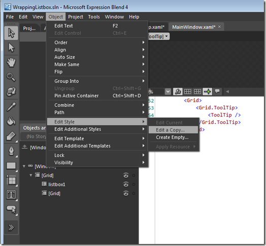
Or use Expression Blend by selecting an object in Xaml then from the Object menu select Edit Style > Edit a Copy..:

image